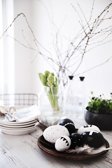
I've fallen in love with these edgy monochrome Easter eggs! And as it's a Danish tradition to paint eggs on Easter Sunday I now feel sufficiently inspired and brave to break away from the traditional Easter colours and have a go at creating some fresh and contemporary looking eggs for myself. The eggs have been decorated by the Swedish blogger Anna-Malin for the Swedish Magazine: "Skona Hem".
Source: Sköna Hem photo by: Anna-Malin
Friday, 29 March 2013
Thursday, 21 March 2013
Skandivis goes off piste
Being married to a South African guy I'm a regular visitor to Cape Town and have long been impressed and inspired by the creativity of the place. So to me, it is no surprise that Cape Town is the designated Design Capital for 2014, as the place is absolutely buzzing!
As Skandivis is all about living the Scandinavian way,I'm never more excited than when I find Scandinavian influences in unusual places. My latest find is the creative hub the Woodstock Exchange located in Cape Town. Apart from housing my favorite Scandi/African brand: Pedersen & Lennard, it's also home to some of the most amazing cafes and workshops in Cape Town right now!
The design partnership Pedersen & Lennard sells hand-made as well as machine-made products that have all been put together in their Cape Town workshop. Their range is influenced by their fascination with South African craft and the clean aesthetic of their Scandinavian forefathers. Below are some of my favorite products from their current collection.
Photos from the Pedersen & Lennard cafe in Woodstock
Below the totally amazing restaurant Superette where I've spent hours people watching and taking in the super cool environment!
Saturday, 9 March 2013
Wood lovely wood...
I'll never get tired of wood and I love how it's used in so many ways to create some gorgeous design! The maple wood knife from The Federal is a beauty and the way wood is used in its design is totally new to me!
1. via 2. Oyoy 3. Fjellby 4. Ferm Living 5. Muuto
6. The Federal
Wednesday, 20 February 2013
Cool restaurant - Nordic designed
Really, what's not to love about the cool Copenhagen restaurant "Höst", the result of a successful collaboration between two well know Danish brands Norm Architects and Menu? Above all, I totally love its unmistakably cosy Scandinavian feel! Höst means harvest in Danish and autumn in Swedish! The restaurant has definitely got that unique autumnal weathered look largely achieved by using materials such as recycled wood and old cast iron that have been left to age gracefully.
Notice the black scissor spring hanging lamps designed by Menu
Black bar Stools from &Tradition
Gorgeous tableware from New Norm in nude natural colours
Innovative use of Euro-pallets
Images via Rum
Notice the black scissor spring hanging lamps designed by Menu
Gorgeous tableware from New Norm in nude natural colours
Innovative use of Euro-pallets
Images via Rum
Wednesday, 13 February 2013
Rough on the ouside smooth on the inside
I've just come across these beautiful photos in the Danish magazine Bo Bedre. Love the contrast between the rough exterior brickwork and the smooth monochrome interior.
Photos: Jonas Bjerre-Poulsen
Subscribe to:
Comments (Atom)


